Magyar vonatkozás: vagy a kép tárgya, vagy a készítője legyen magyar illetőségű.
Legyen feltöltve a Commonsra: kiemeltnek jelölni csak olyan képet lehet, ami a Wikimedia Commonson van, és megfelel a többi feltételnek. Ha nincs a kép a Commonson, akkor a jelölés előtt át kell tölteni, és úgy jelölni.
Jó minőség: éles, megfelelő színegyensúllyal, kontraszttal és fényerővel rendelkezik. Mentes a tömörítési hibáktól (mint például nagy tömörítésű JPEG képek), túlexponálástól, szemcsésségtől és egyéb zavaró hibáktól. (Kivétel ez alól, ha a kép ritka, vagy régi.)
Nagy felbontás: a képnek lehetőleg elég nagynak kell lennie, hogy jó minőségben lehessen sokszorosítani, illetve a nagyfelbontású monitorokon is élvezhető maradjon. Általában legalább 1000 pixel széles vagy magas kép az elfogadható, 2000x1000 vagy nagyobb a preferált, hacsak nem történelmi jelentőségű, animáció, vagy más módon különleges.
Ízelítő a Wikipédia legjobb munkáiból: olyan fénykép, grafikon, ábra, vagy animáció, amelyre büszkék lehetünk.
Szabad licenc: csak és kizárólag közkincs, vagy szabad licencű képek elfogadhatóak.
These are the guidelines for Featured Pictures and for new Quality Images. Quality Image Candidates should meet all of the following requirements and must have been created by a 'Commoner' (ie someone with a login account on commons.wikimedia.org). Featured Pictures Candidates should meet all the following requirements, must have a 'wow factor' and may or may not have been created by a Commoner. Given sufficient 'wow factor' and mitigating circumstances, a Featured Picture is permitted to fall short on technical quality.
Normally there should never be two Featured Pictures that are just different versions of the same image, so if a better version exists the original version should be delisted. The purpose of Featured Picture status is to recognize that an image is currently among the most valuable images - the top fraction of a percent. As overall image quality improves, some images will be delisted. The purpose of Quality Image status is to recognize that at the moment of creation, a 'Commoner' skillfully achieved a desirable level of quality, a recognition that is not erased by later advances.
There is no restriction on the number of similar Quality Images and there is no formal mechanism for delisting Quality Images.
An image “speaks” to different people differently, and has the capacity to evoke emotions such as tenderness, rage, desire, rejection, happiness, and sadness, good photographs are not limited to evoking pleasant sensations.
For Featured Pictures, many voters legitimately believe that a technically ordinary picture of an extraordinary subject can be perceived as a more valuable picture than a technically excellent picture of an ordinary subject. Many other voters equally legitimately believe that each image should be judged purely on its own merits. For example, a technically compromised shot of an important event will often receive some support because of the importance of the event depicted and an equal quantity of opposition because of the technical quality.
Above all, be polite. The image you are judging is somebody's work. Avoid using phrases like "it looks terrible" and "I hate it". If you oppose, please do so with consideration, and an explanation. Remember that not everyone has the same command of English. Choose your words with care.
Happy nominating, happy judging, and remember.... rules can be broken
Mielőtt nekikezdesz a kép vizsgálatának, ajánlatos, hogy kalibráld a monitorodat. Amennyiben ezt nem tetted meg, vedd figyelembe, hogy a vizsgált kép színeit esetleg nem megfelelően látod, valamint előfordulhat, hogy nem látod a kép részleteit a nagyon világos és nagyon sötét részeken.
Utóbbi vizsgálatához végezd el a következő egyszerű tesztet! Nézd meg az alábbi képet teljes képernyős nézetben teljesen fekete háttér előtt. Helyesen beállított monitor esetén a négy körlapból hármat kell látnod. Amennyiben mind a négyet látod, a monitorod túl világosra, amennyiben kevesebb, mint hármat látsz, túl sötétre van állítva.
Olcsóbb TFT monitorok esetén azonban gyakran a különböző betekintési szögekből is más a kép mind a színeit, mind a világosságát illetően.
Legyen helyesen és lehetőség szerint teljes körűen kitöltve az {{információ}}(?) sablon. Előnyös, ha a kép tartalmazza a fényképező készítéskori helyét. (A Commonsban ezt a {{location}} sablonnal érdemes megtenni. Bővebben a geokódolás cikkben olvashatsz róla.)
A kép legyen besorolva a támjához kapcsolódó valamennyi kategóriába (természetesen csak a legszűkebbe).
Lehetőség szerint a kép ne tartalmazzon reklámot vagy aláírást (pl. vízjelet). A szerzői jogi feltételekre és a szerző személyére vonatkozó információkat a kép leírólapjának kell tartalmaznia, és nem a magának a képnek.
Alapelv: a képeknek legalább 2 megapixelnyi valódi információt kell tartalmazniuk. (A normál esetben megengedett legkisebb járatos felbontás az 1600×1200 képpont.) Könnyen elkészíthető képek esetén az értékelők kérhetnek ennél nagyobb felbontású képet, ha az a képre vonatkozóan jelentős előnnyel jár.
Oka: A feltöltött képeknek lehetőleg nem csak arra kell alkalmasnak lenniük, hogy egy szokványos számítógép-monitoron szemléljük, hanem arra is, ha nagyfelbontású képernyőn való megjelenítéshez vagy nyomatásra használják fel. Nem tudhatjuk, milyen eszközöket fogunk a jövőben használni, így fontos, hogy a jelölt kép olyan nagy felbontással rendelkezzen, amilyennel csak lehetséges.
JPEG-tömörítés
Gyakori probléma: túltömörített, alacsony minőségi beállítás a fényképezőgépben, vagy egy későbbi mentés során. Eredménye a látható tömörítési hiba.
Megoldás: Használj jobb minőségi beállítást! Például állítsd a fényképezőgépben a JPEG minőséget „superfine”-ra, vagy fényképezz RAW formátumba, vagy képszerkesztő program használata esetén 95%-os minőségi beállítást használva mentsd el a képet. Amennyiben több alkalommal szerkesztesz egy képet, minden szerkesztést az eredeti képet megnyitva végezz el, vagy használj veszteségmentes képformátumot (pl. XFC): az ismételt szerkesztések és mentések során a JPEG-képek fokozatosan veszítenek minőségükből. Továbbá ne ments el szerkesztett JPEG-képeket jelentősen magasabb minőségi beállítással, mint az eredeti: ez a képméretet jelentősen növeli, de a minőségét nem javítja.
Képzaj
Gyakori probléma: túl sok zaj. Ez lehet színzaj, fényerőzaj, látható szemcsézettség, karcok a szkennelt képen stb.
Alapelv: 100%-os nézet mellett a kép nem tartalmazhat zavaró mennyiségű zajt.
Tanács: A zaj csökkentése érdekében minél alacsonyabb érzékenységet (analóg fényképezők esetén minél alacsonyabb érzékenységű filmet) használj! Pédául egy ISO 200-as film kevésbé szemcsézett képet ad, mint egy ISO 1600-as. Amennyiben a felvétel egyedi körülmények között készült, és nem lehet megismételni, a képet sokszor szűrők használatával is lehet javítani. A minőségi zajszűrő programok azonban drágák és a eljárásuk számításigényes. Amennyiben nem rendelkezel a feladathoz szükséges szoftverrel és hardverrel, kérj meg egy kollégát (aki igen). :)
„koszos” szkennelt kép
Expozíció
Gyakori problémák: Túlexponáltság kiégett részekkel vagy alulexponáltság a részletek sötét részeken való elvesztésével.
Alapelv: megfelelően exponált kép esetén a készített kép túlnyomó részén visszaadja a valóság részleteit. Meg kell jegyezni, hogy az expozíció művészi szándékot is szolgálhat, és kiértékelését a felvétel ötletének és céljának megértésével kell megtenni.
Exposure refers to the shutter diaphragm combination that renders an image with a tonal curve that ideally is able to represent in acceptable detail shadows and highlights within the image. This is called latitude. Images can be on the low side of the tonal curve (low range), the middle (middle range) or high side (upper range). Digital cameras (or images) have a narrower latitude than film. Lack of shadow detail is not necessarily a negative characteristic. In fact, it can be part of the desired effect. Burned highlights in large areas are a distracting element.
advice: When shooting with a digital camera, inspect the histogram.
Overexposed sky with jpeg artifacts.
Color
common problems: White balance off. Distracting (typically purple) hazing at contrast edges, visible in full resolution (chromatic aberration).
guideline: Quality images must have reasonable colors. Note that this does not necessarily mean natural colors.
solution: Color balance can be often corrected in software such as Gimp. If you don't have access to suitable programs and equipment, ask at the Commons:Quality images helpdesk and someone may be able to process the image.
examples:
bad white balance
Focus and Depth of Field
common problems: Improper or undefined focus, insufficient depth of field.
guideline: Every important object on the picture should be sharp. The overall image should have clearly defined focus, for example, the main subject is in focus and the foreground and background are out of focus, or else, the whole scene is in focus. This guideline should be also evaluated with understanding of the idea of the images. Depth of field is often low intentionally. If in doubt, ask. 'Depth of field' (DOF) refers to the area in focus in front of and beyond main subject. Depth of field is chosen according to the specific needs of every picture. Large or small DOF can add to or detract from the quality of the image. Low depth of field can be used to bring attention to the main subject, separating it from the general environment. High depth of field can be used to emphasize space. Short focal length lenses (wide angles) yield large DOF, and vice-versa, long focal lenses (telephotos) have shallow DOF. Small apertures yield large DOF and conversely, large apertures yield shallow DOF.
examples:
bad problem with focus
correct focus and depth of field
shallow depth of field serving a purpose
Motion Blur
common problems: Images blurred just because of shaking hand or subject moving too fast.
guideline: Motion blur in quality images has to have purpose, for example to emphasize motion. 'Movement control' refers to the manner in which motion is represented in the image. Motion can be frozen or blurred. Neither one is better over the other. It is the intention of representation. Movement is relative within the objects of the image. For example, photographing a race car that appears frozen in relation to the background does not give us a sense of speed or motion, so technique dictates to represent the car in a frozen manner but with a blurred background, thus creating the sense of motion, this is called "panning". On the other hand, representing a basketball player in a high jump frozen in relation to everything else, due to the “unnatural” nature of the pose would be a good photograph.
Lighting
common problems: Distracting reflections (usual problem with built-in flash). Unintended vignetting. Distracting harsh shadows. Lens flares.
guideline: Contrary to general belief, front lighting is not usually the best light as it flattens the subject. Side lighting often gives a better 'texture' to surfaces. The best light is often early morning or late afternoon, or on a slightly cloudy day.
Editing
common problems: Editing programs like Gimp have wonderful artistic filters and scripts. Unnecessary use of these, however, can be detrimental to the image.
guideline: Digital manipulation for the purpose of correcting flaws in a photographic image is generally acceptable, provided it is limited, well-done, and not intended to deceive. Typical acceptable manipulations include cropping, perspective correction, sharpening/blurring, colour/exposure correction, and removal of distracting background elements. More extensive manipulations must be clearly described in the image text, for example by means of the törlendő template. Unmentioned or misrepresented manipulations, or manipulations which cause the main subject to be misrepresented are never acceptable.
Composition
common problems: Unclear or non-existent subject.
guideline: The arrangement of the elements within the image should support depiction of the subject, not distract from it. The subject should not be cropped, unless it is only a specific part of the subject that is of interest. Foreground and background objects should not be distracting. You should check that something in front of the subject doesn't hide important elements and that something in background doesn't spoil the composition (for example that the streetlight doesn't "stand" on someone's head).The “Rule of Thirds” is a common guideline for composition that has been inherited from painting. The idea is to divide the image with two imaginary horizontal and two vertical lines, thus dividing the image into thirds horizontally and vertically. Centering the subject is often considered a negative practice. Subjects of interest are placed in one of the “interest points”, where horizontal and vertical lines intersect (4 interest points are created). Horizons are almost never placed in the middle, for they “cut” the image in half. They are placed either in the upper or lower horizontal line. The main idea here is NOT to center the subject without a very good reason.
Distortions
common problems: Tilt, perspective distortion and other distortions. An eye (or, more precisely, a brain) is a sensitive detector capable of spotting even a small tilt ... falling trees, towers and inclined water surfaces rarely improve landscape photography.
guideline: Images should not be unintentionally tilted. Images of architecture should usually be rectilinear. Perspective distortion either should have a purpose or be insignificant.
solution: Tilt can be easily corrected in almost any photo editing software. Various more complicated distortions can be adjusted in programs such as w:Hugin and w:Panorama Tools. If you don't have access to suitable programs or don't understand them, ask at the Commons:Quality images helpdesk and someone may be able to process the image.
guideline: Panoramic images need to have a minimum height of 800px.
Stitching
common problems: Stitching artifacts. Colors or luminance are not consistent across the image. Horizon line sinusoidal or even more complicated shape.
guideline: Getting a good panorama ready takes time. Recent releases of programs like hugin and enblend make simple errors like bad alignment and ghosts at blurred seam lines less common than they used to be, but parallax errors and more intricate quality problems still occur. Two examples:
The ingredient photos were taken with a camera not in panorama mode, and camera-bundled software was used for the top stitch. One notices that the left part is darker, due to the camera exposing each photo individually. This could be dealt with by adjusting brightness before stitching.
More subtle errors are at the right of the castle, where there appear to be two vertical bands in the sky. Look where these bands touch the hill, at the middle one the stitching program misaligned, producing a ghost. Also, the program feathers the transitions. While this avoids a visible edge, one can see that in such feathering region, image noise is reduced, which makes these parts stand out from the rest of the image.
The bottom image shows that using different software, the photos can be stitched without such errors.
Lighting
common problem: different exposure in different images, leading to overexposure or visible differences in brightness and posterisation
guideline: Even when photos are taken with the camera in panorama mode, unless one chooses an overall exposure for all images to handle the brightest part of the brightest image, then blown highlights are likely.
Ciemniak panorama.jpg
If possible, set for underexposure, as well as panorama mode. Expected advances in software based exposure correction may soon make panorama construction viable from a photo series not shot in panoramic mode. Until then, use the brightest part of your panoramic scene to set the in-camera exposure when shooting.
Some software provides blending algorithms that make the seamline invisible. But if the brightness of the original photos differs significantly, one still notices a transition in between photos. A few minor misalignments notwithstanding, this is what the top photo shows.
Some programs incorporate brightness adjustment for the photos, but the algorithm has to be designed carefully otherwise one can end up with posterisation effects like the purple and light blue patches in the clouds on the left in the bottom image.
Vignetting:
Blending-only programs can do away with seam lines and smooth structure using feathered overblending, but to correct lens vignetting one needs a radius-dependent brightness correction.
Deliberately strong vignetting
The left image shows a technically acceptable stitch, except for the vignetting effect which has been strongly exaggerated. Good stitching programs incorporate vignetting correction. Pre-processing the input images is less elegant, but one can obtain good results. In the sky can be seen three bright areas, separated by two darker bands. These correspond to the middles and the sides of the three original images. Although programs like enblend remove visible seam lines, they do not remove vignetting effects. In the sequence hugin-enblend it is at the hugin stage where vignetting has to be corrected, either inside a recent hugin version or as already corrected input.
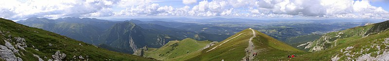
On the right is a more subtle example of vignetting, most visible in the sky, where one can see three bright areas from left to right separated by two darker bands. These correspond to the middle and the sides/corners of the three original images.
See in the photo below how the sky brightness spans the spectrum without being burnt out, but still the sky brightness has a wavy structure, most noticeable in the left part.
Tatra Mountains Panorama 01.jpg
Camera positioning
For the left stitch, the photographer captured the bottom part of the church, then stepped left and took a photo of the top part. The seam line is visible in the windows just below the clock, and one sees shifts in different directions in the middle and on the tower structures. Stitching software is not meant to cope with such parallax error as the problem here is located behind the camera, and the way out in this case was the availability of matching photos, albeit from a different perspective, to create the image on the right.
Image alignment
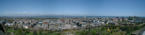
Proper alignment of images is a crucial first step and has been achieved in this view taken in the Western Scottish Highlands. But the exposure differs between images and cameras have vignetting, both make seamlines visible. And as these photo have been aligned regarding the distant features, some parallax errors can be seen at seamlines in the foreground. There exists software that makes such seams disappear and the parallax errors can be at concealed by choosing a suitable seamline.
Composition
common problems: Panoramas frequently lack a central focal point. If taken within urban settings, much of the scene may be uninteresting, and unattractive features such as rubbish bins and light poles almost impossible to avoid.
Copyright status. Quality image candidates have to be uploaded to Commons by the copyright holder under a suitable license. The full license requirements are at COM:CT
Quality images must be categorized, have a meaningful title and description. This should include the Taxa naming for organisms.
No advertisements or signatures in image. Copyright and authorship information of quality images should be located on the Image page and may be in the image metadata, but should not interfere with image contents.
Pictures must have been created by a Wikimedian in order to be eligible for QI status. This means that pictures from, for example, Flickr are ineligible. (Note that Featured Pictures do not have this requirement.)
Graphics located on Commons may be used not only for viewing them on a screen. They may be also used for printing or for viewing on very high resolution monitors. We can't predict what devices would be used in the future either, so it is important that pictures being nominated have a reasonably large resolution. 2 megapixels is normally the lower limit, but for 'easy to take' images, reviewers may demand more. (Not applicable for SVG images).
Digital images can suffer various problems originating in image capture and processing, such as noise, problems with JPEG compression, lack of information in shadow or highlight areas, or problems with capture of colors. All these issues should be handled correctly.
The arrangement of the subject within the image should contribute to the image. Foreground and background objects should not be distracting. Lighting and focus also contribute to the overall result; the subject should be sharp, uncluttered, and well-exposed.
This is a summary of what to look for when submitting and reviewing FP candidates:
Resolution - Photographs of lower resolution than 2 million pixels are typically rejected unless there are 'strong mitigating reasons'. Note that a 1600 x 1200 image has 1.92 Mpx, just less than the 2 million level.
Graphics located on Commons may be used in ways other than viewing on a conventional computer screen. They may be also used for printing or for viewing on very high resolution monitors. We can't predict what devices may be used in the future, so it is important that nominated pictures have as high a resolution as possible.
Scans - While not official policy, Help:Scanning provides advice on preparation of various types of images that may be useful.
Focus - every important object in the picture should normally be sharp.
Foreground and background - foreground and background objects may be distracting. You should check that something in front of the subject doesn't hide important elements and that something in background doesn't spoil the composition (for example that the streetlight doesn't "stand" on someone's head).
General quality - pictures being nominated should be of high technical quality.
Digital manipulations must not deceive the viewer. Digital manipulation for the purpose of correcting flaws in a photographic image is generally acceptable provide it is limited, well-done, and not intended to deceive. Typical acceptable manipulations include cropping, perspective correction, sharpening/blurring, and colour/exposure correction. More extensive manipulations, such as removal of distracting background elements, should be clearly described in the image text, by means of the törlendő template. Undescribed or mis-described manipulations which cause the main subject to be misrepresented are never acceptable.
Value - our main goal is to feature most valuable pictures from all others. Pictures should be in some way special, so please be aware that:
almost all sunsets are aesthetically pleasing, and most such pictures are not in essence different from others,
night-shots are pretty but normally more details can be shown on pictures taken at daytime,
beautiful does not always mean valuable.
On the technical side, we have exposure, composition, movement control and depth of field.
Exposure refers to the shutter diaphragm combination that renders an image with a tonal curve that ideally is able to represent in acceptable detail shadows and highlights within the image. This is called latitude. Images can be on the low side of the tonal curve (low range), the middle (middle range) or high side (upper range). Digital cameras (or images) have a narrower latitude than film. Lack of shadow detail is not necessarily a negative characteristic. In fact, it can be part of the desired effect. Burned highlights in large areas are a distracting element.
Composition refers to the arrangement of the elements within the image. The “Rule of Thirds” is a good guideline for composition and is an inheritance from the painting school. The idea is to divide the image with two imaginary horizontal and two vertical lines, thus dividing the image into thirds horizontally and vertically. Centering the subject is often less interesting than placing the subject in one of the “interest points”, the 4 intersection between these horizontal and vertical lines intersect. Horizons should almost never be placed in the middle, where they “cut” the image in half. The upper or lower horizontal line is often a good choice. The main idea is to use space to create a dynamic image.
Movement control refers to the manner in which motion is represented in the image. Motion can be frozen or blurred. Neither one is better over the other. It is the intention of representation. Movement is relative within the objects of the image. For example, photographing a race car that appears frozen in relation to the background does not give us a sense of speed or motion, so technique dictates to represent the car in a frozen manner but with a blurred background, thus creating the sense of motion, this is called "panning". On the other hand, representing a basketball player in a high jump frozen in relation to everything else, due to the “unnatural” nature of the pose would be a good photograph.
Depth of field (DOF) refers to the area in focus in front of and beyond main subject. Depth of field is chosen according to the specific needs of every picture. Large or small DOF can either way add or subtract to the quality of the image. Low depth of field can be used to bring attention to the main subject, separating it from the general environment. High depth of field can be used to emphasize space. Short focal length lenses (wide angles) yield large DOF, and vice versa, long focal lenses (telephotos) have shallow DOF. Small apertures yield large DOF and conversely, large apertures yield shallow DOF.
On the graphic elements we have shape, volume, colour, texture, perspective, balance, proportion, etc.
Shape refers to the contour of the main subjects.
Volume refers to the three dimensional quality of the object. This is acomplished using side light. Contrary to general belief, front lighting is not the best light. It tends to flatten subject. Best light of day is early morning or late afternoon.
Colour is important. Over saturated colours are not good.
Texture refers to the quality of the surface of the subject. It is enhanced by side lighting… it is the “feel” to the touch….
Perspective refers to the “angle” accompanied by lines that disappear into a vanishing point that may or may not be inside the image.
Balance refers to the arrangement of subjects within the image that can either give equal weight or appear to be heavier on one side.
Proportion refers to the relation of size of objects in picture. Generally, we tend to represent small objects small in relation to others, but a good technique is to represent small objects large contrary to natural size relationship. For example, a small flower is given preponderance over a large mountain…. This is called inversion of scales.
Not all elements must be present. Some photographs can be judged on individual characteristics, that is, an image can be about color or texture, or colour AND texture, etc.
Symbolic meaning or relevance…. Opinion wars can begin here…. A bad picture of a very difficult subject is a better picture than a good picture of an ordinary subject. A good picture of a difficult subject is an extraordinary photograph.
Images can be culturally biased by the photographer and/or the observer. The meaning of the image should be judged according to the cultural context of the image, not by the cultural context of the observer. An image “speaks” to people, and it has the capacity to evoke emotion such as tenderness, rage, rejection, happiness, sadness, etc. Good photographs are not limited to evoking pleasant sensations….
You will maximise the chances of your nominations succeeding if you read the complete guidelines before nominating.


 „koszos” szkennelt kép


 correct focus and depth of field


 törlendő